
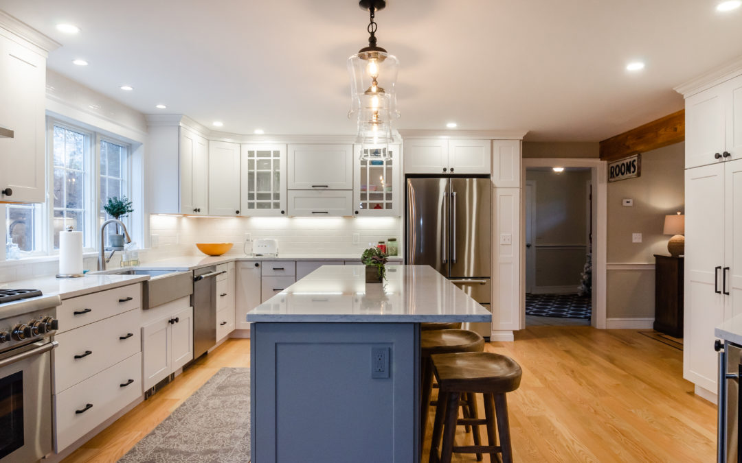
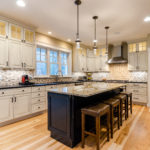
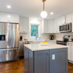
It’s time to break the rules! Just like white pants are no longer a fashion faux pas after Labor Day, you don’t have to match every color in your kitchen. Adding a contrasting kitchen island color is a great way to warm up cool colors, cool down warm colors, or simply add a pop of color to the most popular room in your house.
Why Contrast Island and Cabinets
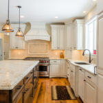
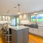
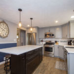
Kitchen cabinets, particularly in large kitchens, can take up a lot of space. If your cabinets are all one uniform color, encountering that wall of color can be at best, boring or at worst, imposing. Adding a kitchen island in a contrasting color can add some interest to the space and break up the blandness of a single color. Contrastingly, keeping the island countertop the same as the main countertop signals cohesion.
Contrast Material
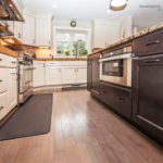
Color isn’t the only way to add interest and contrast with a kitchen island. You can also consider a natural or stained wood island to contrast colored cabinets. Wood tones are generally warm and can make the kitchen island a point of invitation into the heart of the home.
How to Choose a Contrast
While there are no hard and fast rules for choosing a kitchen island color, below are some general rules of thumb:
Choose the same color in a lighter or darker shade
This keeps all of the colors in the room in the same color family and can make choosing a color fairly simple. Just try not to choose too stark or too similar a color – too stark can look garish and too similar can look like a mistake.
Choose a similar color, nearby on the color wheel
Similar to the advice above, try not to choose a color too stark a contrast or too similar.
Choose a complementary color on the color wheel
Using the official color wheel, the general advice is a color opposite your original color, typically complements the original color.
Choose an appropriate shade of white
Consider the same advice as the first two rules. White complements almost any other color including wood tones. The key to choosing the right shade of white is choosing the appropriate coolness or warmth of the shade.